
Loading…
Building a conversion program that respects what shoppers already know.

The brand
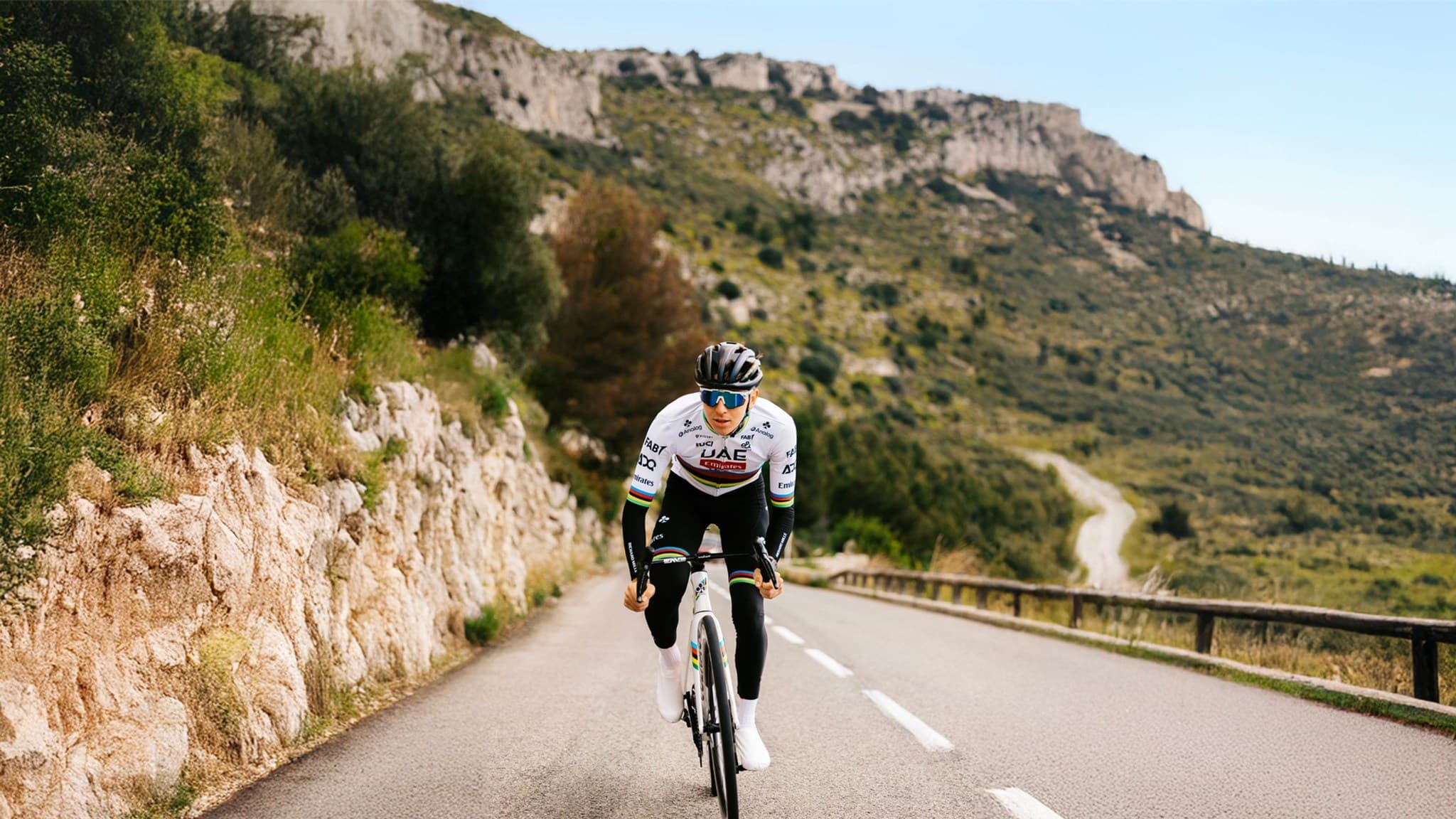
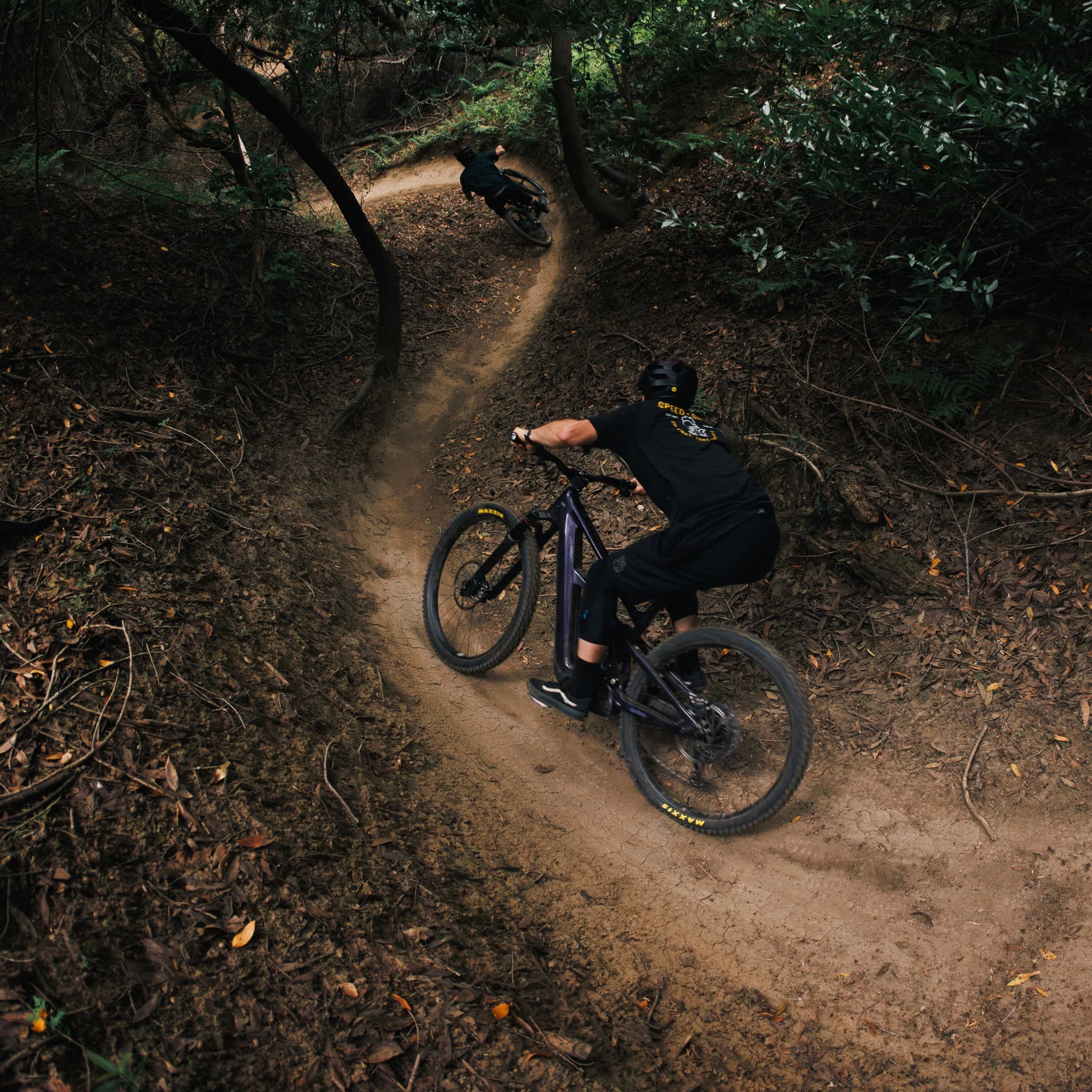
Jenson USA is one of the largest independent cycling retailers in the United States. Their catalog spans mountain, road, gravel, and e-bikes, frames and components, apparel and accessories, with a dedicated sub-brand for shipping fully built bikes. The audience runs from weekend riders to dedicated racers.
Shoppers arrive with strong product knowledge and specific intent. The goal of the partnership has never been to attract more traffic. It's to convert more of the right traffic by removing the friction that gets in the way of a shopper who's already made up their mind.
The impact
They're consistently coming to me with new ideas and making sure the road map is well populated.

The challenge
Cycling shoppers arrive with brand preferences, model knowledge, and very specific component requirements. A site that explains too much loses them. A site that explains too little loses everyone else.
A shopper picking out a derailleur cares about speed compatibility, drivetrain brand, cage length, and chain pitch. A shopper picking out their first complete bike cares whether it will arrive built. The same product page has to answer both.
Inventory split between an East-coast warehouse and a West-coast one means a multi-item order sometimes arrives in two boxes on two different days. Setting honest delivery expectations matters as much as the purchase decision itself.
The underlying platform limits what can change without engineering investment. Every test has to earn its place in the dev queue.
The approach
Card sorts tested whether the navigation matched how shoppers actually grouped categories. Tree testing checked whether new IA helped or hurt findability. A full usability scorecard sat real users in front of the site and recorded where they stalled, what they ignored, and what convinced them. The qualitative work set the agenda for the quantitative work.
Buy-box hierarchy got rebuilt around how cyclists actually scan a page. Stock-urgency signals showed up only where warehouse data justified them. Visual icons replaced wordy spec strings. Sticky add-to-cart followed long technical PDPs down the page so the decision moment was never out of reach.
The flyout cart got restructured around how this audience compares before committing. Mini-cart, modal, and drawer variants ran head to head. Checkout interstitials, guest-checkout defaults, and the way returning customers re-identify themselves all got tested against how the data showed the audience actually behaving.
New-bike-day video content on the PDP. Photos of how a complete bike actually ships, taken from inside the warehouse. What-to-expect Q&A that addressed the realities of an online bike purchase: assembly, sizing, returns, and the in-between days waiting for the truck.
What we learned
Knowing the product doesn't make a shopper immune to friction. It just changes what counts as friction.
The job isn't less information. It's the right information at the right moment, in a hierarchy that's been tested.
A program that pairs qualitative research with quantitative iteration builds knowledge the team can keep spending.
The results
The biggest gains came from places the team had stopped looking. Decision-supporting detail moved earlier in the journey. Compatibility and fitment logic became a first-time-shopper feature instead of an expert filter. Cart and checkout treated the shopper as someone who already knew what they wanted and just needed the site to get out of the way. Every test sharpened the next. Every research study set up the next round of tests. The program built compounding knowledge about this audience, and the site has kept improving for it.
The takeaway
When the audience already knows what it wants, the work is removing what's in the way.
Frequently asked
Their audience arrived with intent. The job was to find and remove the friction stopping that intent from completing, without dumbing down a site built for shoppers who actually know what they're looking at.
Conversion rate optimization, user research, UX/UI design, and data analysis, running as a continuous program rather than discrete projects.
Product detail pages and buy boxes, the flyout cart and full cart flow, checkout interstitials and forms, navigation and search, homepage above- and below-the-fold layout, and bike-specific content like delivery expectations and assembly. Plus the underlying research, card sorts, tree tests, and usability scorecards, that shaped what got tested next.
Constantly. As Jenson USA's catalog, platform, and customer base have evolved, the testing roadmap has evolved with them. New research opens new test threads, and shipped winners free up bandwidth for the next set of experiments.
Modern Home & Living
A CRO program scored on what a lead was worth, not just how many came in
Read case study
Beauty & Wellness
Their redesign was ready. We helped them know it would land before they pushed it live.
Read case study
Modern Home & Living
A premium decking brand with no online checkout. We helped turn long, research-heavy buying journeys into sample orders, source book requests, and qualified dealer connections.
Read case study