
Loading…
Fracture sells a gift most people have never bought before. Rebuilding the mobile homepage, so it teaches first and sells second, turned more first-time visitors into buyers.


The brand
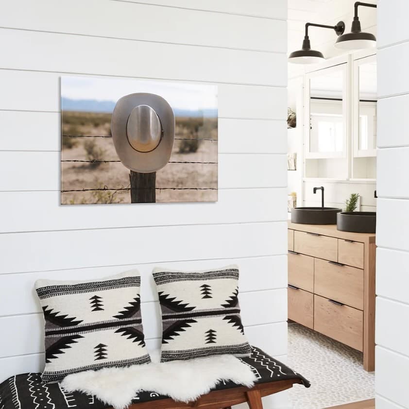
Fracture prints photos directly onto glass: no frame, no fuss. The product is tactile, personal, and almost always bought as a gift. That makes the buying decision emotional rather than transactional, and the website has to do meaningful work to bridge the gap between a visitor arriving with a photo in their head and a customer who feels confident enough to upload it.
It is also a product most people have never bought before. Nearly every new customer Surefoot interviewed had never ordered a glass print, and most had never heard of one. The site carries a real teaching burden: it has to explain what the product is and why it is worth the price before it can ask anyone to upload their favorite photo.
The impact
Surefoot was an excellent partner. They truly owned CRO and experimentation end to end, from strategy through execution, and consistently delivered thoughtful, high-quality work. I have a high bar for agencies I work with, and Surefoot met and exceeded it. I would absolutely work with them again.


The challenge
In research, nearly every new customer had never ordered a glass print and most had never heard of one. Before the site could sell, it had to teach.
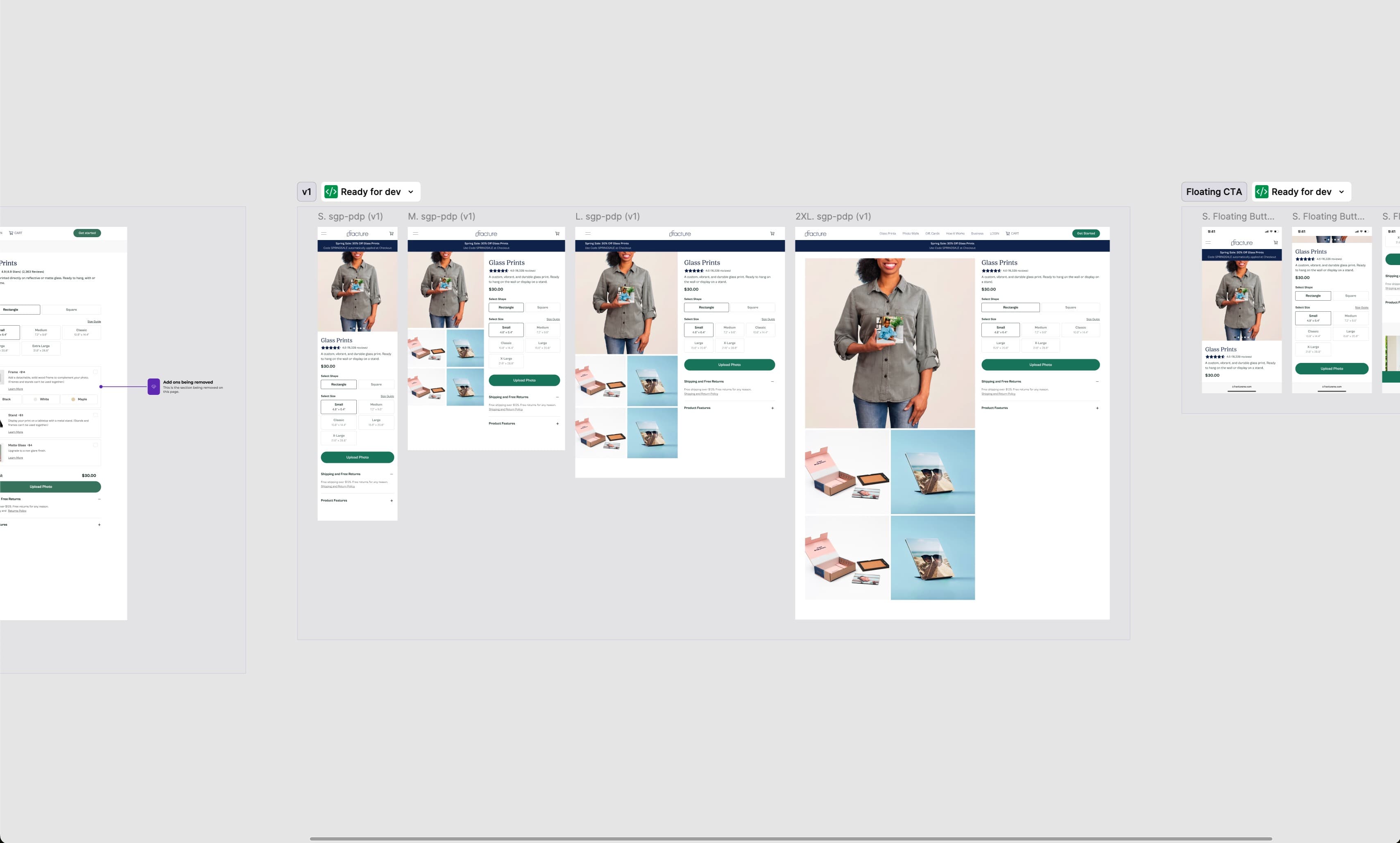
The most important context sat below the fold, and it was worse on mobile, where most visitors landed. The homepage was carrying the whole story and losing people before it could be told.
The homepage asked first-time visitors to grasp an unfamiliar product and find their way at the same time. The main upload CTA gave little context, and text links were not connected to the images they described.
The approach
Surefoot ran moderated interviews with new customers. The finding reframed the work: this was a comprehension problem before it was a conversion problem.
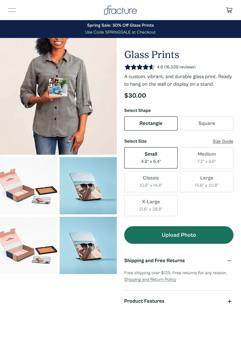
Clarified the hero copy to state plainly what Fracture makes, pulled the value proposition above the fold, and added the brand's UGC carousel so first-time visitors could see real prints.
Redesigned the product cards to connect imagery with detail, and pointed the primary CTA into the Get Started upload flow instead of a generic shop link.
Results were tracked in Convert and validated against GA4 and BigQuery, with sample sizes and significance stated plainly rather than rounded up.
What we learned
Most visitors arrived on mobile. Pulling the value above the fold there, rather than treating mobile as a shrunk-down desktop, changed the entire funnel.
On the old homepage, the calls to action all sat up top, before visitors understood the product. On the rebuilt page, each section made its own case and carried its own call to action, so visitors acted on the one that matched what they had just read.
For a product most people have never bought, explaining it clearly is not a preamble to the conversion work. It is the conversion work.
The results
The rebuilt mobile homepage produced statistically significant lifts across the funnel: more photo uploads, more add-to-carts, and double the transactions compared with the homepage it replaced. Visitors also spent more time on the site and viewed more pages, and heatmaps showed them engaging with content all the way down the page rather than stalling at the top. The new homepage was doing the teaching the old one could not, and Surefoot recommended hard-coding it.
The takeaway
Rebuilt for how mobile shoppers actually arrive, Fracture's homepage doubled mobile transactions and turned more first-time visitors into buyers.
Frequently asked
First-time buyers were landing on a mobile homepage that buried the value of an unfamiliar product and asked them to do too much at once.
Conversion rate optimization and experimentation, supported by moderated user research.
Most visitors arrived on mobile, and research showed the homepage was burying the product's value there. It was the highest-leverage place to start.
Treat the mobile homepage as the front door for first-time buyers: lead with what the product is, put the value above the fold, and make the next step obvious.
Modern Home & Living
A CRO program scored on what a lead was worth, not just how many came in
Read case study
Sports & Recreation
Building a conversion program that respects what shoppers already know.
Read case study
Beauty & Wellness
Their redesign was ready. We helped them know it would land before they pushed it live.
Read case study